“I think it pisses God off if you walk by the color purple in a field somewhere and don't notice it.”
Alice Walker, The Color Purple
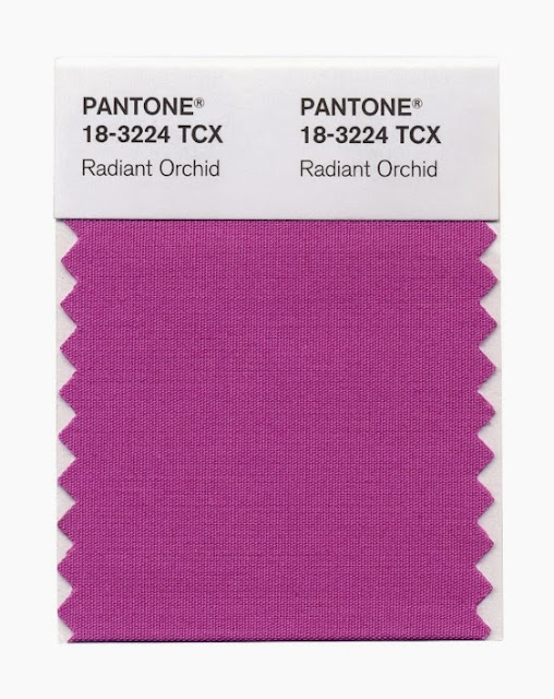
By now I'm sure you've heard the news. Each year, Pantone, the international authority on color for designers, manufacturers, and retailers, announces an upcoming color of the year. So, without further ado, the Pantone 2014 color of the year is... drumroll please... Radiant Orchid.
Now don't panic if purple isn't your passion.
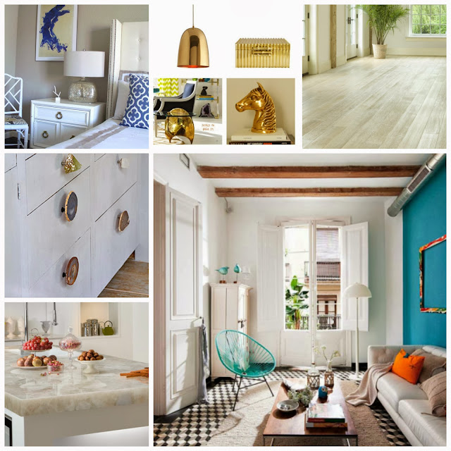
One thing to keep in mind with bold colors such as orchid, it's best to use it in small doses. Think accessories. Think pops of color. Think temporary. And I always suggest keeping your main color palette neutral, especially large scale furnishings and permanent fixtures such flooring and countertops.
Here are some realistic and practical design inspirations for incorporating this color into your home for 2014.
Flowers
Flowers are the most logical choice for adding the color orchid. They are inexpensive and can be added throughout your home in arrangements that fit with every style.
Variation
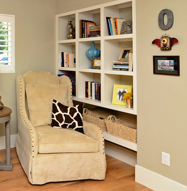
I tend not to take trends and so-called design rules literally. I prefer to use them as a guide. While Radiant Orchid is certainly vibrant and eye popping on its own, use it in a similar or muted version for a more subtle approach.
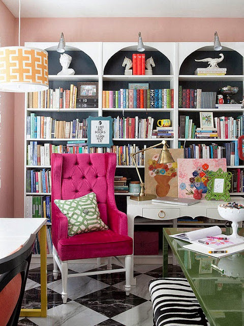
Accents
Pillows, window treatments and artwork are easy to trade out once a fad goes out of style. As always, stay tuned...


