8.29.2013

Life Is Better at the Lake

"Perhaps the truth depends on a walk around the lake."
Wallace Stevens 

Aah, the lake. There's nothing like breezy days spent picnicking on the shore and canoeing on the water. Breath taking views with the sound of water lapping on the shore. That's the lakeside lifestyle.

Two of my upcoming projects are lake front homes surrounding Oquirrh Lake in the new Lake Village neighborhood in Daybreak, Utah.

I'm working on concept boards for the builder, Rainey Homes. The home plans are open and airy with wrap around porches, large windows and casual indoor/outdoor living. Oh, and best of all, the homes were designed to maximize views of the lake. 

In the next few weeks I'll be posting the digital design boards I've created. The homes will have subtle color palettes with pops of color, natural linen and cotton fabrics, and beachy textures like seagrass and wicker.

As always, stay tuned...

8.26.2013

Pewter Power

"And the race is on."
Sawyer Brown"

There's nothing like giving yourself three weeks to undertake one of those nagging little home renovation projects (you know... the one's you'll start/finish someday) before you host a surprise 40th birthday party for your spouse.

That's exactly what my long-distance client Apryl did. She decided the aforementioned surprise party was the perfect excuse to tackle the powder room remodel that she'd been contemplating for a year.

Since Apryl lives out-of-state, she and I consulted via text and online. We talked about the main issues the powder room has (dated, poor lighting), what gets to stay (toilet and floor), and what she'd like it to feel like (light, sparkly, modern).

She sent me some existing shots of her powder room along with some inspiration images:
The sad, little powder room before. 
Ahhh... Apryl's hopes and dreams for her powder room.

After we developed a clear vision, I gave Apryl a list of shopping resources along with advice and direction while she did the leg work.

Once the powder room is finished, I'll post the and final product and the corresponding Room Recipe.

As always, stay tuned... 

8.20.2013

The White House

"So white is the mother of all colors
The churning of all yellow, blue, green
Colors sacrifice their egos
To the eternal white."
John Matthew


Strangely, I've had an obsession with white for the past few years. For those of you who know my tendency to use color everywhere, it's been an interesting personal evolution in design style.

White serves as a blank slate, an empty canvas when used in design. White is timeless, and works with all styles from tropical to traditional, classical to contemporary. White provides contrast to the world around us.

So during our quest for an exterior house color, we decided on white. 

Here are a few of my inspiration images:


This week, our house is gonna get its white on. Oh yah.


As always, stay tuned...

8.19.2013

Back to School Again

"Woe is me, all summer long I was happy and free.
Save my soul, the board of education took away my parole."
Grease 2

Random. Yes. Nerdy. Probably. From one of my favorite 80s movies, Grease 2, a tribute to my boys going back to school:


8.15.2013

15 Shades of Gray

"So, I don't have time for a lot of shades of gray."
Neil Cavuto

Selecting an interior paint can be overwhelming. Frankly, color selection can be somewhat of a, well... gray area.

It's no surprise then that one of the biggest struggles my clients have is selecting that oh-so-perfect color. There are literally thousands of colors to choose from, not to mention the hundreds of shades within a color.

With gray still being all the rage in interior design, I've narrowed down my top 15 picks for shades of gray with five from Benjamin Moore, five from Sherwin Williams and five from KWAL (a.k.a. Frazee, Color Wheel, General and Parker Paint).

I've selected each color within its specific brand because I DO NOT recommend color matching (that is, taking a color formula from one brand and having it matched for another brand). Each brand has a  base color that is specifically designed to coordinate with each color formula. Although color matching results are usually pretty close, on occasion it can go oh-so-wrong, and it's not worth the risk.

I personally have used or have seen these paint colors in what I refer to as "real life" and have outlined characteristics of each color based on my experience.

I recommend painting a small area of each possible color on the wall prior to making that final pick. And don't forget to take your carpet, lighting and furnishings into consideration.

If you've used any of these paint colors, I'd love to hear your thoughts...


TITANIUM OC 49
Characteristics: A light shade of gray with cool undertones.

REVERE PEWTER HC 172
Characteristics: A warm "greige" often referred to as the perfect mix of gray and beige. May have peach/pink or green undertones depending on the light. Very popular color choice for updating brown/tan/gold paint without going too gray.

WINTERWOOD 1466
Characteristics: A warm gray with a slight green undertone. Similar in value to BM Revere Pewter with less tendency to look pink.

GRAY HORSE 2140-50
Characteristics: A mid-tone gray with a bluish-green undertone. 

CHELSEA GRAY HC 168
Characteristics: A slightly darker warm gray that works well as an accent color.


COLLONADE GRAY SW7641
Characteristics: A popular "greige"similar to BM Revere Pewter, but slightly darker in value.

MINDFUL GRAY SW7016
Characteristics: A warm, mid-tone gray without being so "greige".

DORIAN GRAY SW7017
Characteristics: A slightly darker mid-tone gray than SW Mindful Gray.

INTELLECTUAL GRAY SW7045
Characteristics: The darkest and warmest "greige" of all my recommendations. 

GRAY MATTER SW7066
Characteristics: A cool yet slightly darker mid-tone gray. Similar to KWAL Artesan.


PACKING NUT 2881W
Characteristics: A warm mid-tone gray. Similar to BM Revere Pewter.

HAND DUSTER 2932W
Characteristics: A cool mid-tone with a slight green undertone.

TINMAN 3232W
Characteristics: A cool mid-tone gray with a slight blue undertone. This is a good choice for a middle-of-the-road gray.

HAILSTORM 3012W
Characteristics: A mid-tone gray, slightly darker in value than KWAL Tinman with a slight bluish-green undertone. 

ARTESAN 3013M
Characteristics: A slightly darker gray than KWAL Hailstorm. This is a popular exterior paint color.

8.12.2013

It's Been A Long Time Comin'

"It's been a long time comin', my dear, It's been a long time comin', but now it's here."
Bruce Springsteen

It's been nearly two years since my last post and so many things have happened! But, for the sake of keeping this conversation relatively short, I will post glimpses of the best and biggest moments:

We sent our oldest son (the tall guy to my right) on a two-year 
LDS Mission to San Bernardino, California.


We moved into our unfinished home.

I opened a full-service interior design showroom in Bountiful called LIV Showroom with
Kristen Holm, Deboni Sacre and Pam Jensen.


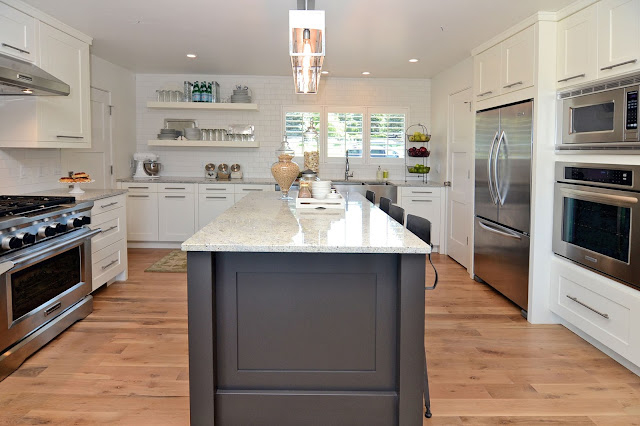
We finished our kitchen... yay!


I began working for Rainey Homes as their Interior Designer.

The girls and I from LIV attended a couple of furniture markets.


My husband wrote and released his first book, I Knew Their Hearts.


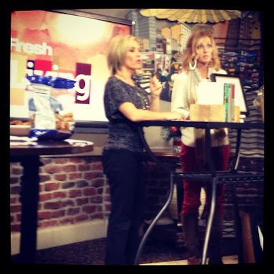
I appeared on local talk shows Fresh Living and Studio 5 for LIV Showroom.

I wrote a book called Room Recipes: A Creative and Stylish Guide to Interior Design 
to be released September 19, 2013.

My two youngest boys became *gasp* teenagers.


And most recently, we began landscaping and renovating the exterior of our home
(more on this to come).


Oh, and I did some interior design in between all of that
which I'll start posting about on my blog!

Stay tuned...


SITE DESIGN BY DESIGNER BLOGS