3.11.2014

My House Reveal: Dining Room

“One cannot think well, love well, sleep well, if one has not dined well.” 
Virginia Woolf

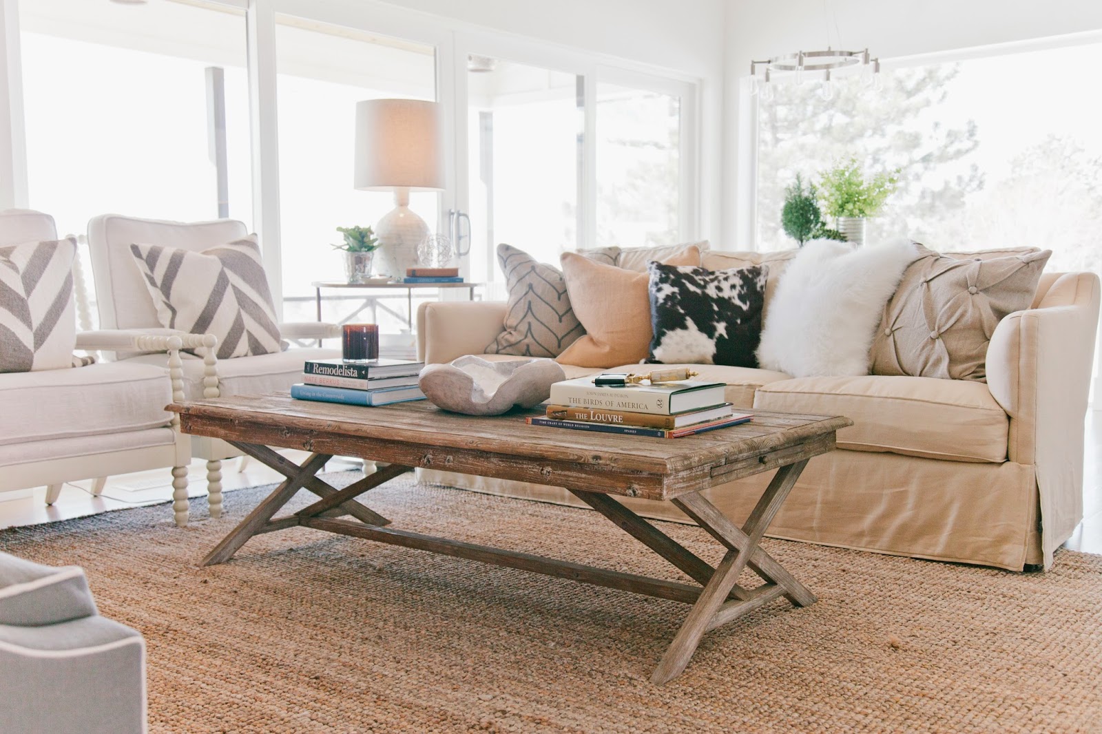
The open floor plan combines the dining and adjacent living area into a single, large gathering space where family members and guests can interact during the entire course of a visit, not just during the sit-down meal. 
Admittedly I am not the best cook on the planet. I can make a mean tater tot hot dish (as we call it in Minnesota) or a respectable pot of use-what-you-have-in-the-pantry soup. But when these culinary delights are shared in the ambience of a beautiful dining room, somehow they just seem to taste better.


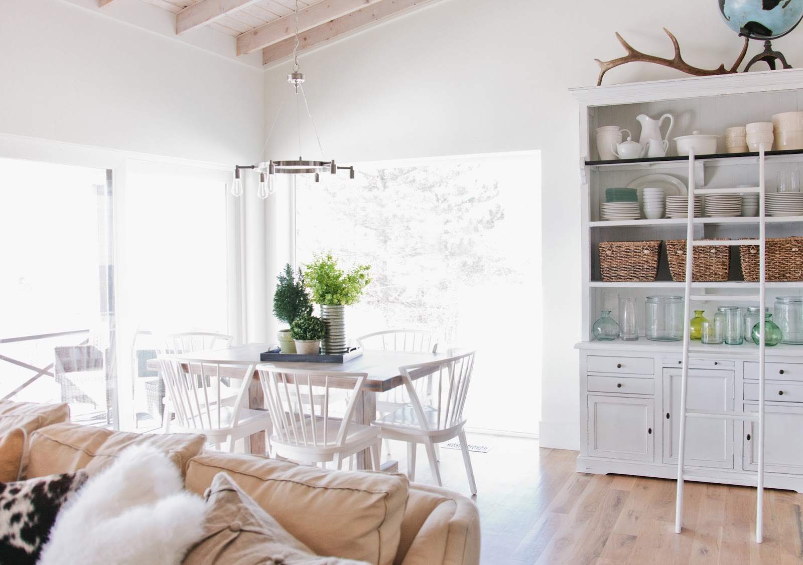
The biggest challenge I had in decorating this space was finding a table the seated six while comfortably filling the space in front of the floor to ceiling windows. After a frustrating game of this table is too big, that table is too small, I found an old, inexpensive trestle table that was ahhh, just right. 

My husband and I spent a Saturday afternoon stripping, sanding and staining it to its natural perfection.


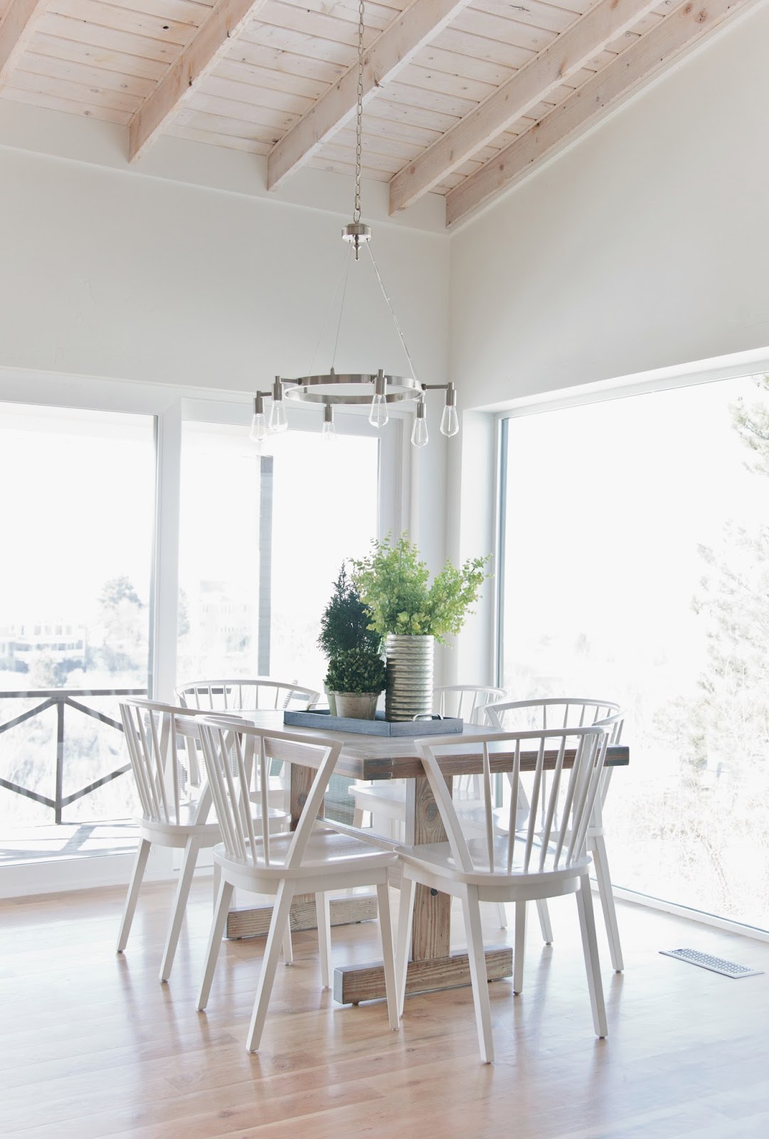
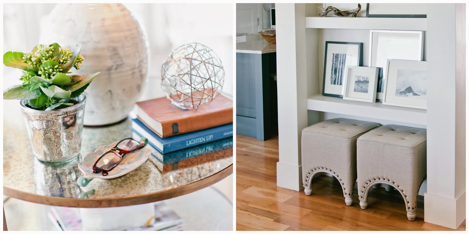
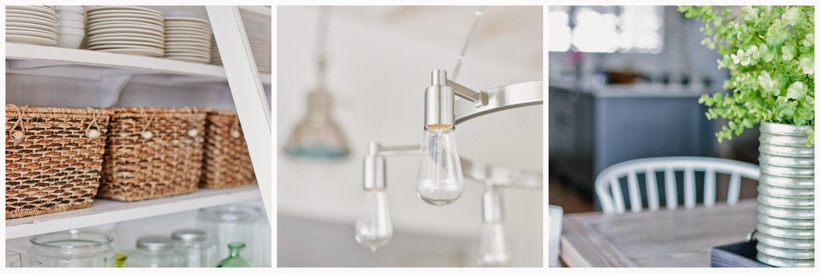
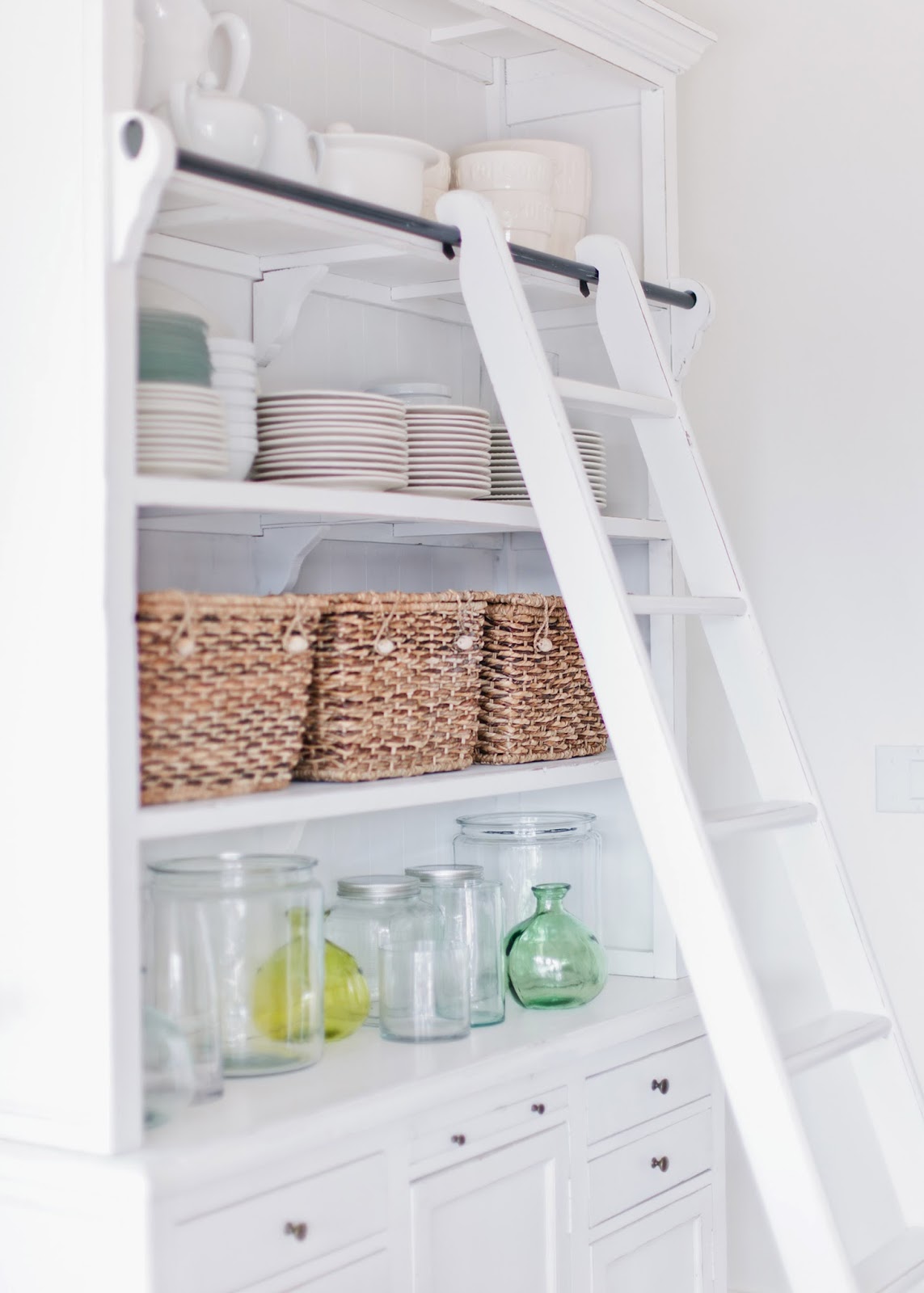
Keeping with the light, monochromatic palette, I also found an open shelved hutch (with a cute ladder!), perfect for displaying dishes, baskets full of linens and assorted vases and jars.


 I have a few more rooms to reveal, so as always, stay tuned...

{photos by Sara Boulter}

2.21.2014

My House Reveal: Powder Room

"Never underestimate the power of a powder room...
the small size of a powder room gives you the ability to really make a statement."
, Houzz contributor

I chose a bold floral pattern wallpaper and a decorative ceiling light for my small, windowless powder room. The bold turquoise leaves pull in the subtle variations of the same color throughout the rest of my home. 
Dare to be bold in the powder room! The tiny, often windowless, room is the perfect space to add a pop of pizazz in your home. Patterned wallpaper, distinctive art, and dramatic lighting are all simple ways to make an eclectic statement.
Artwork, flowers and a contrasting floor pattern add to the eclectic feel of the space.

Not quite sure how you feel about making such a bold statement? Here are some other inspirational powder rooms:

Brown Design
Elle Decor 
Elle Decor
Massucco Warner Miller 
Still not convinced? Check out the latest LIV Showroom blog post with some great resources and additional insight into using wallpaper. 

As always, stay tuned...

2.12.2014

My House Reveal: Den and Study

“A room without books is like a body without a soul.” 
Cicero


Welcome to my den and study, the combination of two formerly small bedrooms united into one magnificent area for watching TV, reading, and working from home.

One of the initial disagreements my husband I had when we were renovating was where to place the TV on the main level. My thought was that it should go in the living room so that the family could enjoy the TV in the main living area (e.g. living room, dining room, kitchen). My husband, on the other hand, did not want a TV to distract from the incredible views from the living room, and felt that the TV should be a secondary focus rather than the main.

Our solution? We created a den. I'm so glad I let my husband win that argument *wink wink*


Likewise, the study serves as our family work area. It is connected openly to the den to encourage family together time. The study is decorated with an eclectic mix of personal mementoes like an oversized canvas portrait of my husband in his rodeo days. Yeehaw!


The functionality of the two-rooms-in-one serve our family well, and the diverse mix of furniture and accessories keep the rooms informal and fun.

As always, stay tuned...

2.05.2014

My House Reveal: Master Suite

"In the end, I think that I will like that we were sitting on the bed, 
talking & wondering where the time had gone."
Brian Andreas


As the last room we see at night and the first room we see in the morning, the master bedroom is one of the most important spaces in our home. In order for a master bedroom to feel as grand as it's purpose, there are several things to take into consideration when planning this space. 

When we purchased this 1960s rambler, one of the unusual things about it was the size of the master bedroom. It was LARGE. Homes from that era are typically know for smaller bedrooms. So with that in place, we only had to make minor architectural changes to make it into our dream bedroom.
The first thing I wanted to do was to salvage the hardwood floors. They were in impeccable condition even after 50 years! Unfortunately, the unique size of the wood slats were not available, so we opted to install wool carpet in the bedroom instead. 


The second thing I noticed was that there wasn't a large enough wall to comfortably accommodate our king size bed. I decided to replace the existing patio doors with a wall and replace the window with a large set of sliding patio doors that would walk out to a private deck. 

Although the room was relatively large, I still wanted to expand the space. Since moving walls was not an option, I chose to coffer the ceiling to add height and install faux beams for visual interest. I had a custom barn door made to prevent the door from swinging into the room and impeding the bathroom walkway.

Finally, a master suite wouldn't be complete without a master bathroom. We opted to forgo the bathtub in lieu of a large walk in shower, a trend I'm seeing more and more of lately.

More house to reveal coming soon. As always, stay tuned...

1.29.2014

My House Reveal: Living Room

"I love my house, oh, yes-sir-ee,
My own little house in my old oak tree."
Miriam Young, 
children's author of Miss Suzy


I've always had a fascination and love for the homes I've lived in. I'm sure my predilection stems from a few of my favorite childhood books including The Little House and Miss Suzy

As a child, I loved playing "house". I loved creating my own space, setting up pretend rooms and arranging things just so. It's no surprise that I became an interior designer. As an adult, I get to play house for real!

I've posted about the renovation of our house over the past couple of years, but it's only been recently that we've been able to finish furnishing the main level (sometimes even interior designers only get to work on their own projects a little bit at a time!).
If I had to pick a theme for my house, I would label it as Rustic Modern Industrial. There are lots of natural elements like slate, white oak, glass and steel combined with distressed and casual furniture pieces. A textured rug, spooled accent chairs, and a coffee table that you can put your feet on complete the look.

I wanted to add a touch of elegance to the laid back feel of the space, so I added a brushed brass side table with round mercury glass inlays. Linen tufted ottomans (extra seating) are conveniently tucked into a niche which displays black and white images of some of our favorite places.

I wanted to create a space with plenty of seating where we could all hang out and enjoy the fire (and the amazing view). Despite the open floor plan, floor to ceiling windows and vaulted ceilings, the space feels quite cozy.

I'll reveal a new room in each new post, so as always, stay tuned...

{photos by Sara Boulter}

1.09.2014

3 Practical Ways to Incorporate the 2014 Color of the Year Into Your Home

“I think it pisses God off if you walk by the color purple in a field somewhere and don't notice it.” 
Alice WalkerThe Color Purple

By now I'm sure you've heard the news. Each year, Pantone, the international authority on color for designers, manufacturers, and retailers, announces an upcoming color of the year. So, without further ado, the Pantone 2014 color of the year is... drumroll please... Radiant Orchid.

Now don't panic if purple isn't your passion. 

One thing to keep in mind with bold colors such as orchid, it's best to use it in small doses. Think accessories. Think pops of color. Think temporary. And I always suggest keeping your main color palette neutral, especially large scale furnishings and permanent fixtures such flooring and countertops.

Here are some realistic and practical design inspirations for incorporating this color into your home for 2014.
Flowers
Flowers are the most logical choice for adding the color orchid. They are inexpensive and can be added throughout your home in arrangements that fit with every style. 

Variation
I tend not to take trends and so-called design rules literally. I prefer to use them as a guide. While Radiant Orchid is certainly vibrant and eye popping on its own, use it in a similar or muted version for a more subtle approach.


Accents
Pillows, window treatments and artwork are easy to trade out once a fad goes out of style. 

As always, stay tuned...

1.06.2014

Out With the Old, In With the New?

“We spend January 1st walking through our lives, room by room, 
drawing up a list of work to be done, cracks to be patched. Maybe this year, to balance the list, 
we ought to walk through the rooms of our lives... not looking for flaws, but for potential.”
Ellen Goodman

As I've perused design magazines, websites and blogs, I've compiled a list of the most common IN'S and OUT'S interior design trends for 2014.

Keep in mind that there are differences between a trend and a fad. Trends point toward a certain direction (neutral colors, indoor-outdoor spaces) and evolve over time. Fads, on the other hand, are short-lived (antlers, word decor) and are popular for a brief amount of time.

I've always been a bit leery of interior design professionals who scream Like This! and Don't Like That!, and I tend to take their opinions with a grain of salt. However, there are several common threads amongst the various design experts. Not that I agree with all of them, but I've listed them here:

OUT for 2014
Top left: Stacked books, woodland creatures, antlers. Top right: Distressed furniture. Middle right: Word art.
Bottom left: Ikat print. Bottom middle: Stacked books. Bottom right: Industrial furniture.
OUT for 2014
  1. Ikat prints
  2. Lattice geometric patterns
  3. Antlers
  4. All-white kitchens
  5. Word decor and accessories
  6. Woodland creatures such as birds, owls, foxes, and deer
  7. Stacks of books used as décor
  8. The color grey
  9. Burlap fabric
  10. Distressed furniture
  11. Granite countertops
  12. Industrial furniture
  13. Ombre
  14. Stainless steel appliances
  15. Gallery walls
IN for 2014
Top left: Neutral colors with indigo accents. Top middle: Brass accessories. Top right: White oak floor.
Middle left: Geode hardware. Bottom left: Quartz countertop. Bottom right: Vintage modern with turquoise accents.

IN for 2014
  1. Gold, Brass and Copper
  2. Turquoise
  3. Modern vintage
  4. Light woods and knotty woods
  5. Geodes and quartz accessories
  6. Macramé and fiber-art wall hangings
  7. Window sheers
  8. Corduroy upholstery
  9. Venetian marbled-paper prints
  10. Deco hues such as bright yellow and indigo
  11. Neutral colors
  12. The open concept kitchen
  13. Space designed with aging users in mind
  14. Quartz countertops
  15. Indoor-outdoor spaces
As always, stay tuned...


SITE DESIGN BY DESIGNER BLOGS