1.29.2014

My House Reveal: Living Room

"I love my house, oh, yes-sir-ee,
My own little house in my old oak tree."
Miriam Young, 
children's author of Miss Suzy


I've always had a fascination and love for the homes I've lived in. I'm sure my predilection stems from a few of my favorite childhood books including The Little House and Miss Suzy

As a child, I loved playing "house". I loved creating my own space, setting up pretend rooms and arranging things just so. It's no surprise that I became an interior designer. As an adult, I get to play house for real!

I've posted about the renovation of our house over the past couple of years, but it's only been recently that we've been able to finish furnishing the main level (sometimes even interior designers only get to work on their own projects a little bit at a time!).
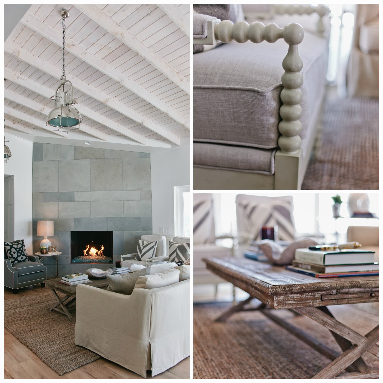
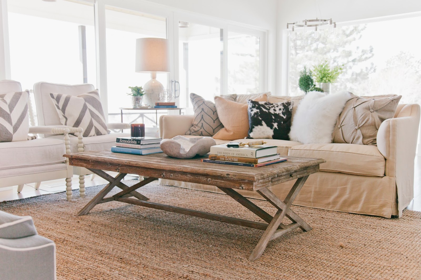
If I had to pick a theme for my house, I would label it as Rustic Modern Industrial. There are lots of natural elements like slate, white oak, glass and steel combined with distressed and casual furniture pieces. A textured rug, spooled accent chairs, and a coffee table that you can put your feet on complete the look.

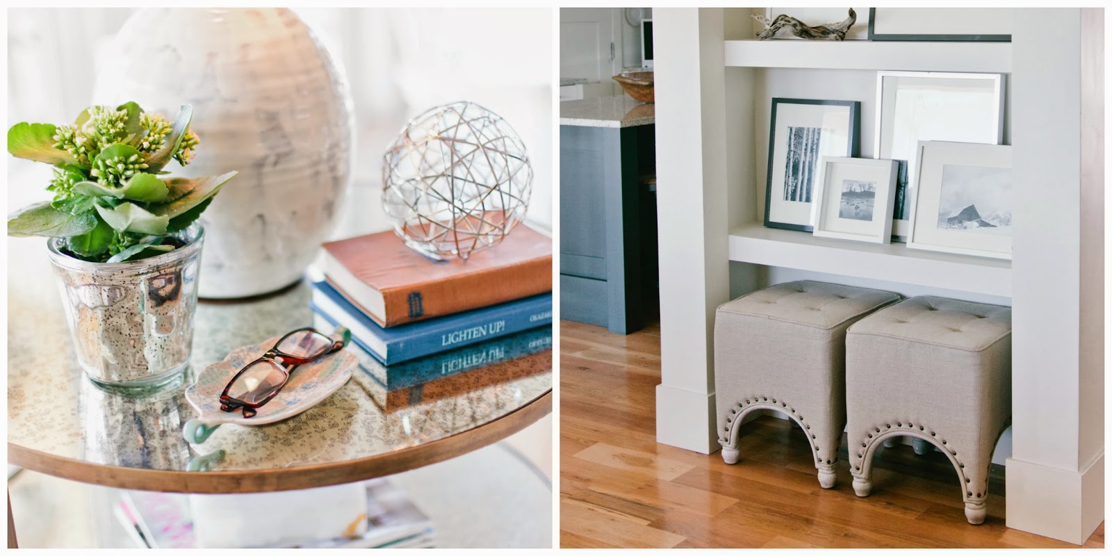
I wanted to add a touch of elegance to the laid back feel of the space, so I added a brushed brass side table with round mercury glass inlays. Linen tufted ottomans (extra seating) are conveniently tucked into a niche which displays black and white images of some of our favorite places.

I wanted to create a space with plenty of seating where we could all hang out and enjoy the fire (and the amazing view). Despite the open floor plan, floor to ceiling windows and vaulted ceilings, the space feels quite cozy.

I'll reveal a new room in each new post, so as always, stay tuned...

{photos by Sara Boulter}

1.09.2014

3 Practical Ways to Incorporate the 2014 Color of the Year Into Your Home

“I think it pisses God off if you walk by the color purple in a field somewhere and don't notice it.” 
Alice WalkerThe Color Purple

By now I'm sure you've heard the news. Each year, Pantone, the international authority on color for designers, manufacturers, and retailers, announces an upcoming color of the year. So, without further ado, the Pantone 2014 color of the year is... drumroll please... Radiant Orchid.

Now don't panic if purple isn't your passion. 

One thing to keep in mind with bold colors such as orchid, it's best to use it in small doses. Think accessories. Think pops of color. Think temporary. And I always suggest keeping your main color palette neutral, especially large scale furnishings and permanent fixtures such flooring and countertops.

Here are some realistic and practical design inspirations for incorporating this color into your home for 2014.
Flowers
Flowers are the most logical choice for adding the color orchid. They are inexpensive and can be added throughout your home in arrangements that fit with every style. 

Variation
I tend not to take trends and so-called design rules literally. I prefer to use them as a guide. While Radiant Orchid is certainly vibrant and eye popping on its own, use it in a similar or muted version for a more subtle approach.


Accents
Pillows, window treatments and artwork are easy to trade out once a fad goes out of style. 

As always, stay tuned...

1.06.2014

Out With the Old, In With the New?

“We spend January 1st walking through our lives, room by room, 
drawing up a list of work to be done, cracks to be patched. Maybe this year, to balance the list, 
we ought to walk through the rooms of our lives... not looking for flaws, but for potential.”
Ellen Goodman

As I've perused design magazines, websites and blogs, I've compiled a list of the most common IN'S and OUT'S interior design trends for 2014.

Keep in mind that there are differences between a trend and a fad. Trends point toward a certain direction (neutral colors, indoor-outdoor spaces) and evolve over time. Fads, on the other hand, are short-lived (antlers, word decor) and are popular for a brief amount of time.

I've always been a bit leery of interior design professionals who scream Like This! and Don't Like That!, and I tend to take their opinions with a grain of salt. However, there are several common threads amongst the various design experts. Not that I agree with all of them, but I've listed them here:

OUT for 2014
Top left: Stacked books, woodland creatures, antlers. Top right: Distressed furniture. Middle right: Word art.
Bottom left: Ikat print. Bottom middle: Stacked books. Bottom right: Industrial furniture.
OUT for 2014
  1. Ikat prints
  2. Lattice geometric patterns
  3. Antlers
  4. All-white kitchens
  5. Word decor and accessories
  6. Woodland creatures such as birds, owls, foxes, and deer
  7. Stacks of books used as décor
  8. The color grey
  9. Burlap fabric
  10. Distressed furniture
  11. Granite countertops
  12. Industrial furniture
  13. Ombre
  14. Stainless steel appliances
  15. Gallery walls
IN for 2014
Top left: Neutral colors with indigo accents. Top middle: Brass accessories. Top right: White oak floor.
Middle left: Geode hardware. Bottom left: Quartz countertop. Bottom right: Vintage modern with turquoise accents.

IN for 2014
  1. Gold, Brass and Copper
  2. Turquoise
  3. Modern vintage
  4. Light woods and knotty woods
  5. Geodes and quartz accessories
  6. Macramé and fiber-art wall hangings
  7. Window sheers
  8. Corduroy upholstery
  9. Venetian marbled-paper prints
  10. Deco hues such as bright yellow and indigo
  11. Neutral colors
  12. The open concept kitchen
  13. Space designed with aging users in mind
  14. Quartz countertops
  15. Indoor-outdoor spaces
As always, stay tuned...


SITE DESIGN BY DESIGNER BLOGS